Showing posts with label Brown. Show all posts

Tuesday, July 31, 2012

Nail P0rn

Hey dudes.  I'm going on vacay with the fam.  It might be quiet for about 2 weeks.  I'll leave you with nail porn...

KleanColor - Midnight Queen

One of my absolute faves.
It is mainly blue, but has small pieces of purple.  It's magical.


Color Craze -Treasure Island
(BCC556)

This is a fine blue and green glitter. It takes 3-4 coats, but it's so worth it.


A generous gift from the lovely and beautiful Emily from Green Eyes Pink Nails

Catrice - Absolutely Chinchilly


Revlon - Scandalous
aka Facets of Fuchsia


KleanColor - Puppy Love

My nails look awfully plump here. Do. Not. Like.


China Glaze - High Maintenance


Like sex.


Oh yea, check my ovals!

Not gonna lie, I bought this for the name.

Essie - Poppie Cock

However, it should be called Poopie Cock, no?

Finger Polish Mania, do you approve ?


China Glaze - Sugar High

Sugar High can look pink or peach depending on the light.  You can see more of it's range in the video below...


Essie - Mucho Dinero


They look better oval when they're longer.

Want to make your nails oval? Read the post here, or watch the video below...


YouTube Channel: http://www.youtube.com/user/loodieloodieloodie

Saturday, October 1, 2011

Humorous vulgarity ahead

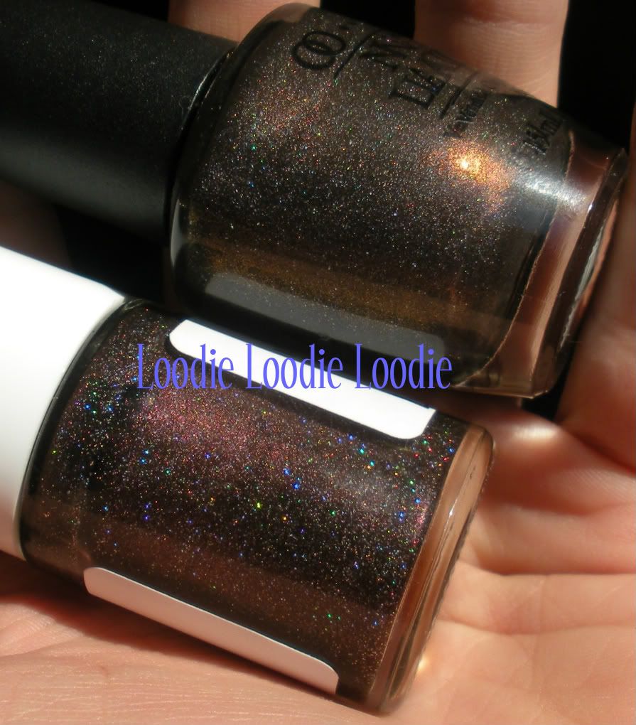
I think we can all agree that Illamasqua is a unique company.  They have a knack for thinking outside the box with pretty much every aspect of their company.  Take a look at any collection they have previously created and I bet money the most common reaction is likely, "wow!"

Part of Illamasqua's charm is their style of product naming, which I find quite entertaining, scandalous, and the perfect breeding ground for vulgar humor ... right up my alley!  The theme and inspiration for "The Theatre of the Nameless" collection seems to be centered around the most illicit of nightlife participants who probably wish to remain anonymous.  However, the polish names in this new collection are so memorable, there is nowhere to hide. 

Please put your mind in the gutter so that we may begin ....

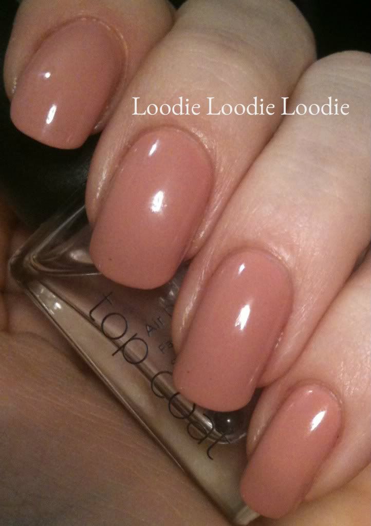
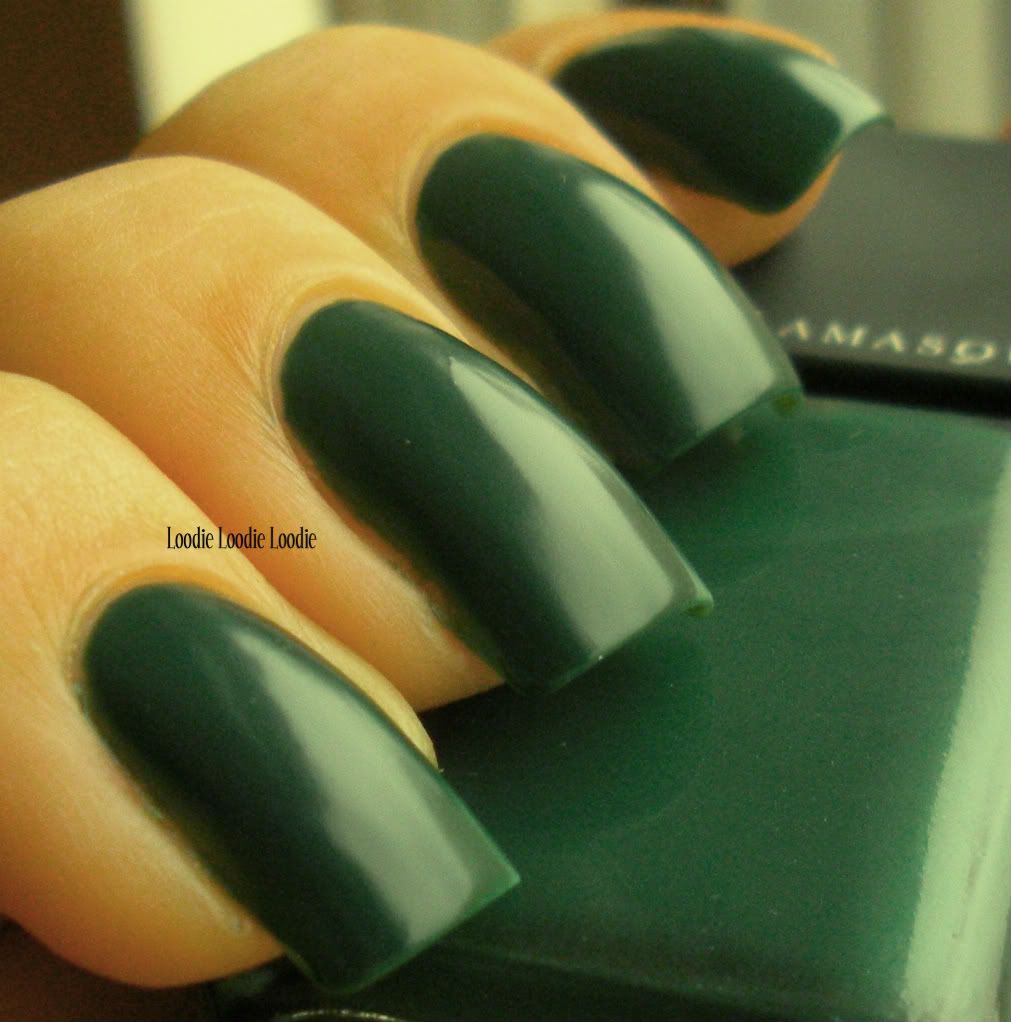
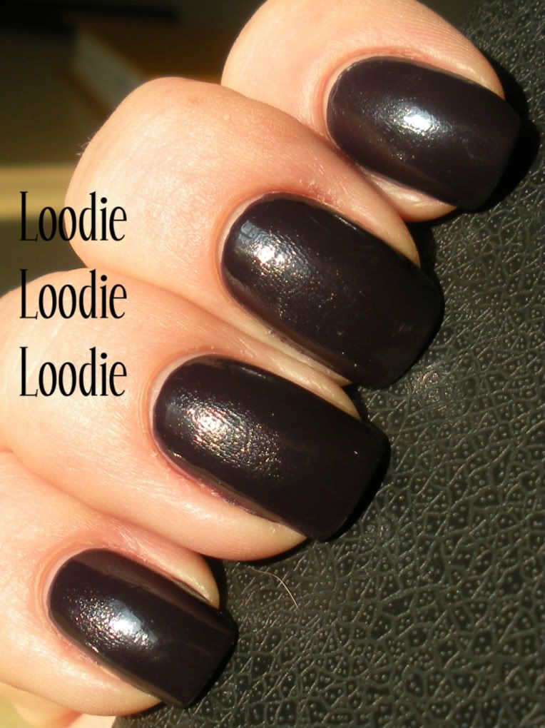
I have to start with this one ...
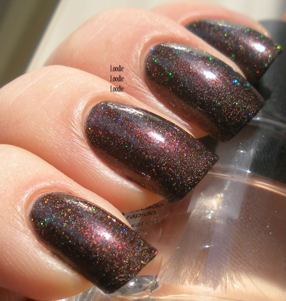
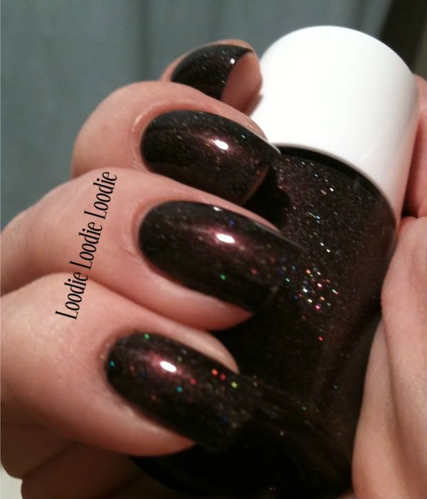
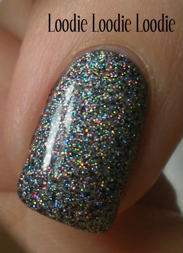
Illamasqua - Taint
2 coats

Holy shiz ... literally ... the best name for this color considering the location of well ... you know ... the perineum. <---click if you want to brush up on some human anatomy

The formula and brush were very nice for me.

The finish on all of these polishes is a new waxy "rubber-look".  I usually love creams and jelly's, but for some reason preferred the rubber look on all of these.

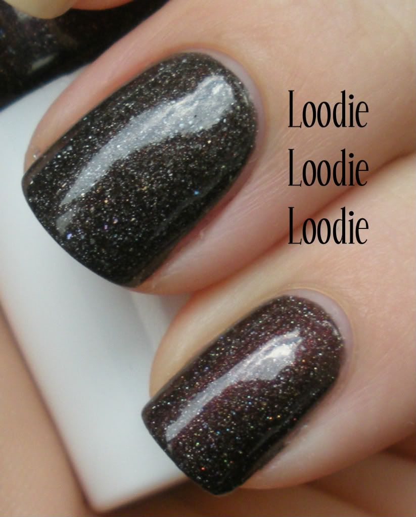
Here is a comparison between a shiny and a dull Taint.  
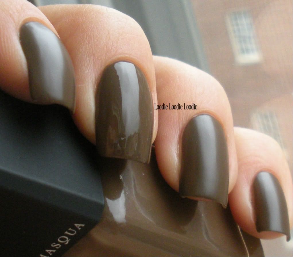
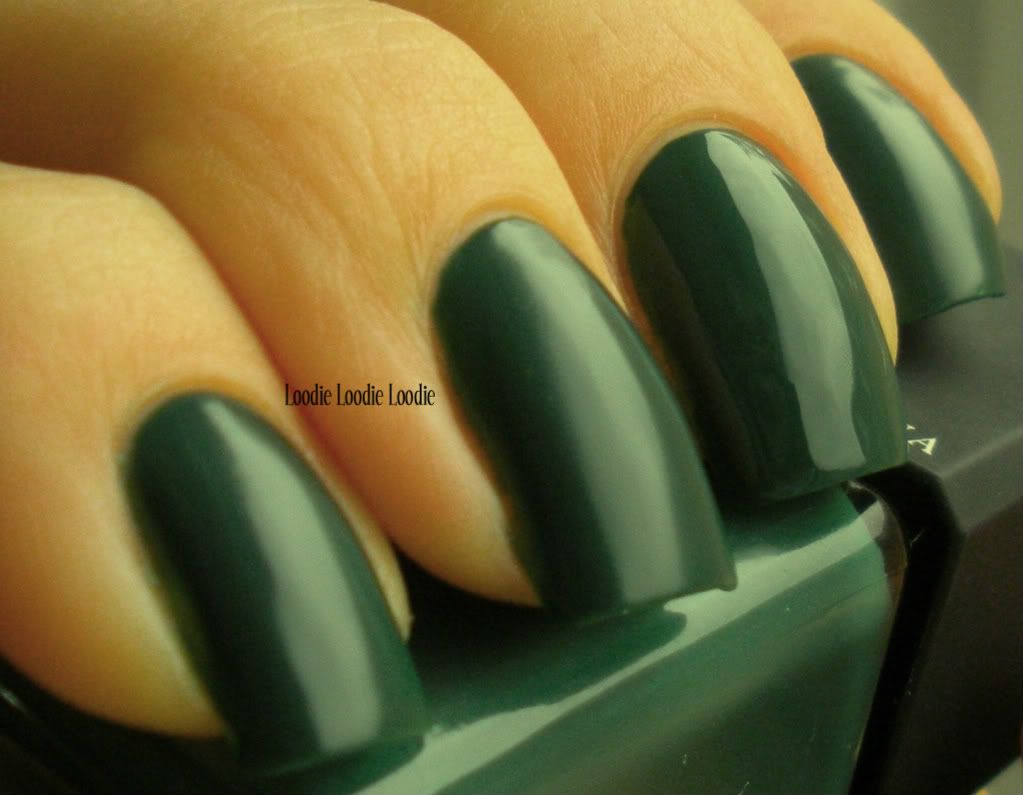
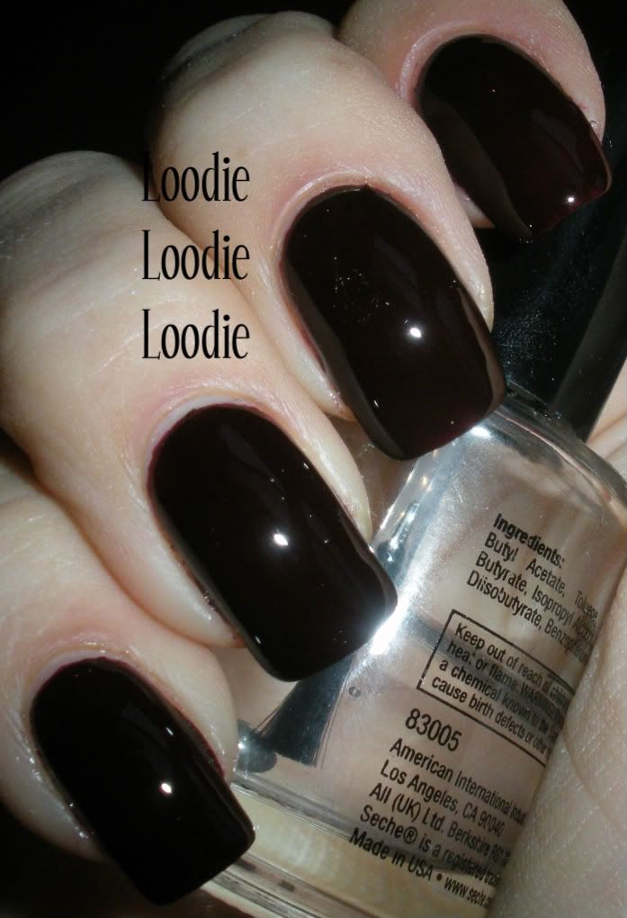
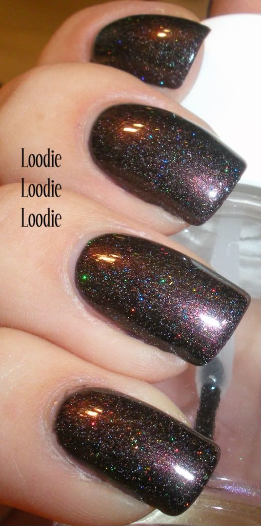


Illamasqua - Vice
2 coats

This could use a third coat if you are not a fan of visible nail line.  Also, if you plan to wear this color, it may be necessary to purchase a whip.


Vice does look slightly different in different lighting situations.  More vampy in low light.
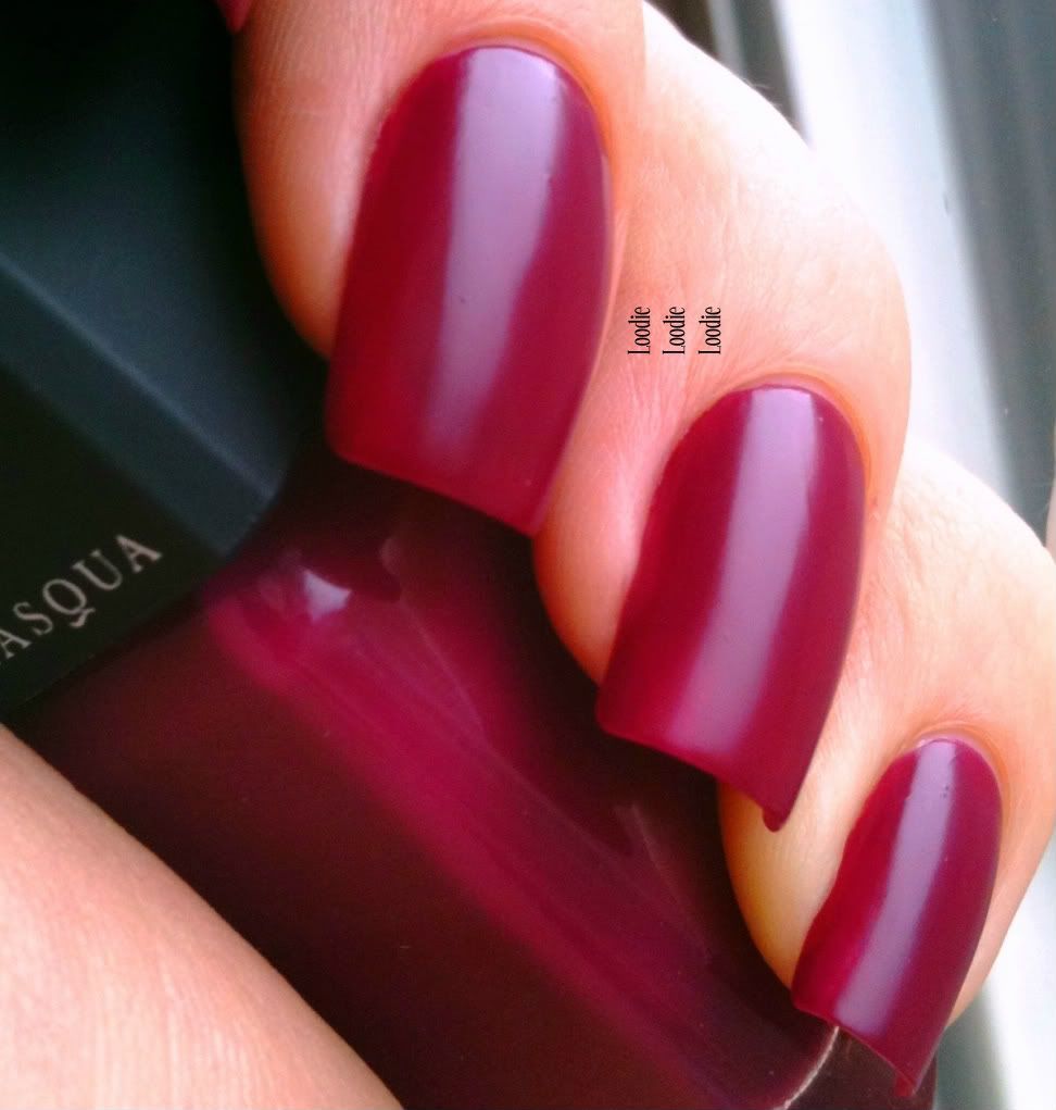
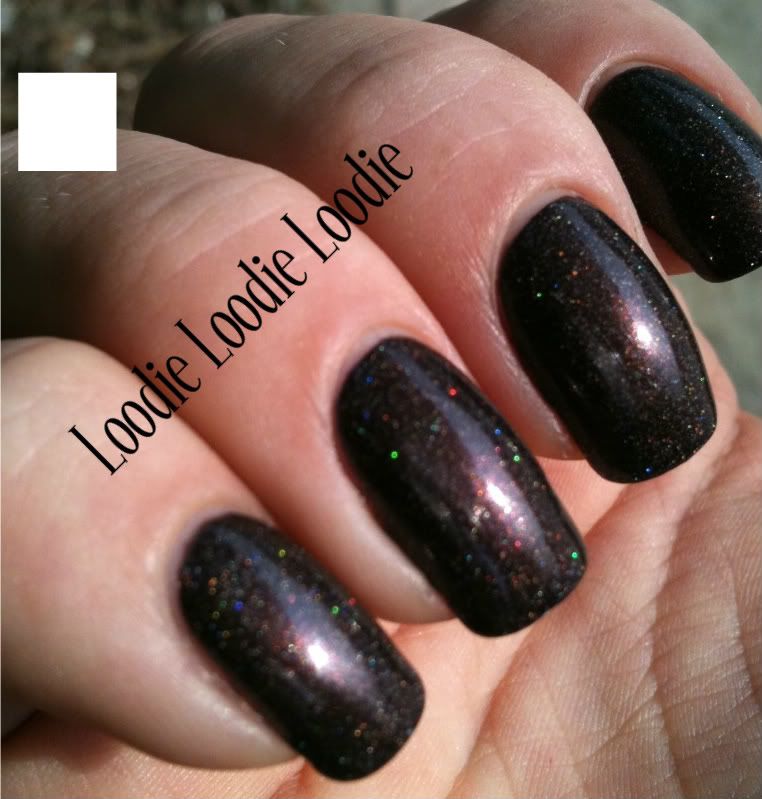
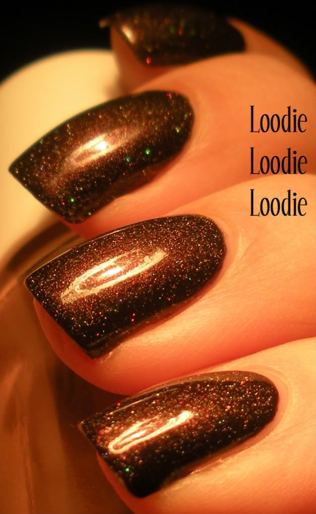


Illamasqua - Kink
2 coats

*Random thought* ...
When you were in high school and someone wore green, did you guys used to say they were horny?  Weird, I'm still trying to figure that one out.


Here is another shot showing a shiny and rubber finish. 

Now that you have purchased a whip, you may want to invest in rubber thigh high boots to complete the look ... and get KINK-AY!


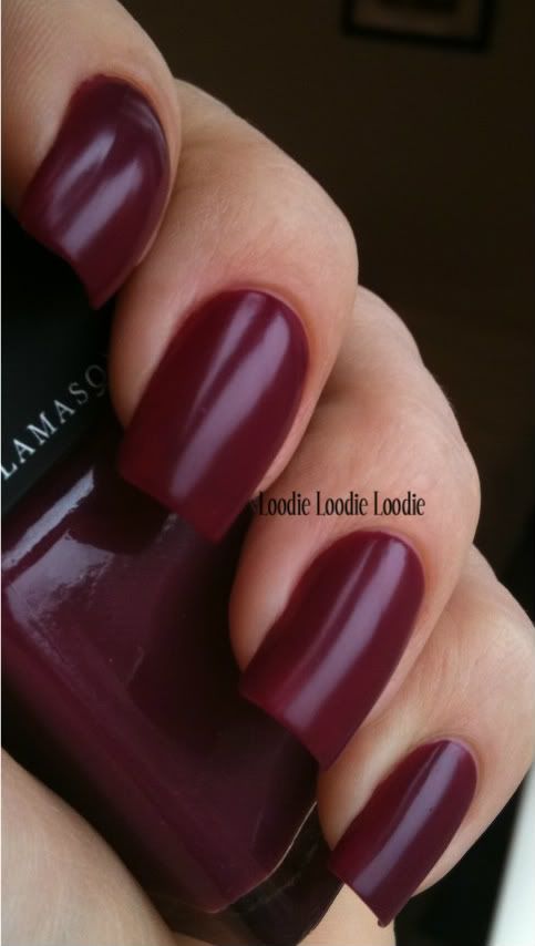
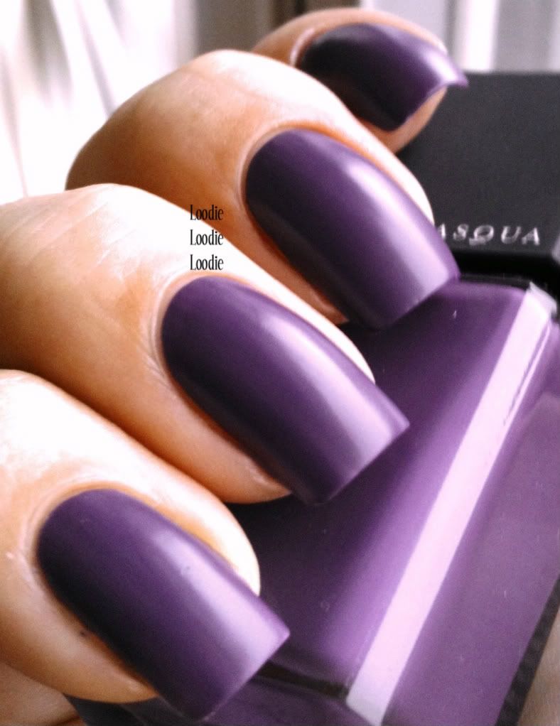
And the most difficult one to photograph for last ...

Illamasqua - Faux Pas
1 coat

I had to doctor this photo a bit to get the color right because my camera likes to make it blue.  Although the color is described as a blue violet, it's definitely on the purple side, as shown.

I think the best thing about these polishes are the names and the rubber finish.  I never thought I would like the satin/suede/rubber finish, but since these are very basic colors it gives them a little something extra.


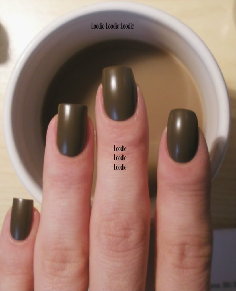
And because I can't help myself ...

Look, a Taint on my coffee cup!  

*The polishes in this post were provided by Illamasqua's PR department ... thank you!*

Friday, July 1, 2011

My Dirty Jet

Ummm so I accidentally made a dupe of a OPI's defective batch of My Private Jet.  Actually, NO not a dupe, it's better :P

How did this happen?

I really wanted something brown and burgundy; really rich and delicious. However, after the smoke cleared I some how ended up adding some holo stuff to it and yummy, it became near edible.

(I don't advise the latter)

I probably could have made this more holo; maybe next time.  I like this one as it stands.

2 coats in the sun <3
Gosh I don't know where to start.  How about a comparison first to the defective MPJ:

Mine is on the bottom.
Definitely more burgundy. 

Bottle pic's next!


I think mine is more sparkly too :D


Alright here is what I used:

Cover Girl - Goddess
ZOMG if you don't have this you should! China Glaze - Fairy Dust is similar.  I'm sure there are others, feel free to leave a comment ...

Color Club - Love Em/Leave Em
Perhaps a more holo version of something would be better

Color Club - Jewel of a Girl

Color Club - Nothing But Truffel


That very first pic is two coats on its own.  Now on to the layering ...

OPI Siberian Nights - How lush.  I'm a little mad it looks black most of the time though.

Flash shot!


Seriously, see it's black in most lights.

Natural indirect light.  Still hot though!


Aahh only in the sun do you see the deep purple plum.

One day I woke up to sheet marks! Ugh, it was horrible!! I had to go to work all day like this.  I'm sure I am the only one that noticed.


Came straight home and layered this baby.


Sunlight picture!

It's definitely darker than in the first picture, hu?
I love these fluorescent light pictures.  It makes them so squishy looking.


Here is an incandescent light picture.  Still YUM.

What do you think?